Dialog
The GUIDialog is one of the most common way to compose visual elements, represented as a dialog window. It provides a simple way to create a dialog with a specified height, alignment, title, and keyboard state (if the keyboard is visible or not when opening). Dialogs can contain various elements, such as labels, buttons, and text boxes.
Constructor
Section titled “Constructor”GUIDialog( enum Height height, enum Alignment alignment, const char* title, enum KeyboardState keyboard);Creates a dialog with given title. Child element such as labels need to be added later with AddElement().
The GUIDialog class defines the following enums:
Height
Section titled “Height”Height is the percentage of the screen taken by the dialog. Possible values are:
Height25Height35Height55Height60Height75Height95
Their real pixel size could be approximated using the following formula:
screen_height * 0.55 - 6
Alignment
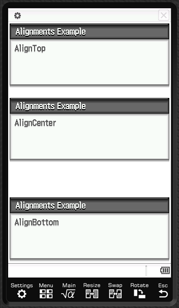
Section titled “Alignment”AlignTopAlignCenterAlignBottom
KeyboardState
Section titled “KeyboardState”Indicate in which state the keyboard should be when the dialog is shown. Values are:
KeyboardStateNone(keyboard is hidden)KeyboardStateMath1KeyboardStateMath2KeyboardStateMath3KeyboardStateTrigKeyboardStateVarKeyboardStateABCKeyboardStateCatalogKeyboardStateAdvanceKeyboardStateNumber
Depending on the keyboard, layouts may change.
For example the KeyboardStateABC looks like this:
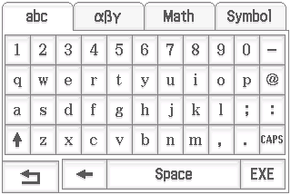
where the KeyboardStateMath1 looks like this:
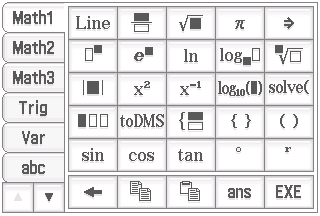
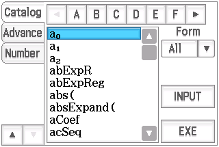
and the KeyboardStateCatalog provides also a different navigation, looking like this:
DialogResult
Section titled “DialogResult”When exiting, the dialog returns various codes. The two well-defined returns codes for dialog are :
DialogResultOK, indicates normal termination (“OK” have been clicked)DialogResultCancel, indicates a canceled event (Dialog was dismissed or closed)
Member Functions
Section titled “Member Functions”Show dialog
Section titled “Show dialog”DialogResult ShowDialog();Would display the dialog and wait for its completion. Jump to the 👨💻 Usage for usage examples.
On event
Section titled “On event”int OnEvent(struct GUIDialog_Wrapped *dialog, struct GUIDialog_OnEvent_Data *event);Event handler triggered when a button is clicked or an element is interacted with. Jump to the 👨💻 Usage for usage examples.
Positions
Section titled “Positions”The dialog could be considered as a rectangle, the functions all returns number according to this schema:
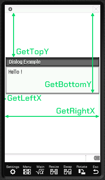
It exposes the following functions:
uint16_t GetLeftX();uint16_t GetTopY();uint16_t GetRightX();uint16_t GetBottomY();
Basically, GetBottomY is GetTopY + dialog height, and same for GetRightX = GetLeftX + dialog width
Children elements
Section titled “Children elements”void AddElement(GUIElement &element);void Refresh();
This element is used in both the main launcher and the demo gui, so be sure to take a look at them for real world usage.
Display a Simple Dialog with a Label
Section titled “Display a Simple Dialog with a Label”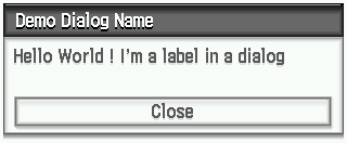
#include <appdef.hpp>#include <sdk/calc/calc.hpp>#include <sdk/os/gui.hpp>
/* * Fill this section in with some information about your app. * All fields are optional - so if you don't need one, take it out. */APP_NAME("Tutorial dialog app")APP_DESCRIPTION("Testing a dialog with a button")APP_AUTHOR("Demo")APP_VERSION("1.0.0")
class DemoDialog : public GUIDialog {public:  DemoDialog()      : GUIDialog(Height25, AlignCenter, "Demo Dialog Name", KeyboardStateNone),        m_greetLabel(GetLeftX() + 10, GetTopY() + 10,                     "Hello World ! I'm a label in a dialog"),        m_closeBtn(GetLeftX() + 10, GetTopY() + 55, GetRightX() - 10,                   GetTopY() + 85, "Close", BUTTON_CLOSE_EVENT_ID) {    AddElement(m_greetLabel);    AddElement(m_closeBtn);  }
private:  GUILabel m_greetLabel;
  //  DialogResultCancel is the default dismiss-dialog behaviour  static const int BUTTON_CLOSE_EVENT_ID = GUIDialog::DialogResultCancel;  GUIButton m_closeBtn;};
void main() {  DemoDialog dialog;  dialog.ShowDialog();}
Custom event handler
Section titled “Custom event handler”Let’s now add another button with a custom event
// ...
class DemoDialog : public GUIDialog {public:  DemoDialog()      : GUIDialog(Height35, AlignCenter, "Demo Dialog Name", KeyboardStateNone),        m_greetLabel(GetLeftX() + 10, GetTopY() + 10,                     "Hello World ! I'm a label in a dialog"),        m_customEventBtn(            GetLeftX() + 10, GetTopY() + 85,            GetRightX() - 10, GetTopY() + 85 + 35,            "Custom Event Test",            BUTTON_MY_EVENT_ID        ),        m_closeBtn(GetLeftX() + 10, GetTopY() + 55, GetRightX() - 10,                   GetTopY() + 85, "Close", BUTTON_CLOSE_EVENT_ID) {    AddElement(m_greetLabel);    AddElement(m_closeBtn);  }
  // This is the method that's called when an event occurs.  // The most important information about the event is contained within the  // 'event' parameter.  virtual int OnEvent(struct GUIDialog_Wrapped *dialog, struct GUIDialog_OnEvent_Data *event) {    // Check the ID of the event, to see if it matches an event assigned to    // one of our controls.    if (event->GetEventID() == BUTTON_MY_EVENT_ID) {      m_greetLabel.SetText("Custom Event button pressed!");
      // Refresh the dialog, to ensure the text box's updated content is      // drawn.      Refresh();
      // Since we processed the event, return 0.      return 0;    }
    // If we don't process the event, let the base class process it.    return GUIDialog::OnEvent(dialog, event);  }
private:  GUILabel m_greetLabel;
  //  DialogResultCancel is the default dismiss-dialog behaviour  static const int BUTTON_CLOSE_EVENT_ID = GUIDialog::DialogResultCancel;
  // use a custom event id here  static const int BUTTON_MY_EVENT_ID = 1;  GUIButton m_customEventBtn;
  GUIButton m_closeBtn;};
void main() {  DemoDialog dialog;  dialog.ShowDialog();}